


Colours are a very powerful communication tool. They can have a great impact on people's behavior and their effect is influential from a psychological point of view. Have you ever noticed that the menu of restaurants usually use orange or red colours? Or do you feel relaxed when you are in a room with blue walls? Or do you feel restless and confused after being exposed to yellow for a long time? Why do colours play an important role in the success of advertising? The answer to such questions goes back to the psychology of colours.
In this article, we will answer the following questions:
- How many categories are colours divided into?
- What is the correct way to combine colours?
- What power do colours have?
- What is the impact of each colour in interior spaces?
- Where do these trends lead interior design?
- Who decides on the latest colour trends?
- What are the colour trends of 2020 and what is their impact on interior design?
Colour is the most effective way to convert and transfer energy in your life. From the colour of your clothes to the colour of the walls of your house, even in the field of beauty, make-up and photography, by combining colors and light, the desired mood can be induced. In addition to affecting health, colours each in turn have a special concept and meaning.
Types of colours
Colours are divided into three main categories: neutral colors, warm colors and cool colors. Recently we are considering another category between cold and warm, called mixed colors (cold / warm) (purple, lily, purple, etc.) that are both soothing and exciting.
Neutral colors: black, white, gray, beige, brown
Brown: Earthiness, firmness, firmness, reliability and sometimes reminiscent of human primordiality
Gray: The feeling of needlessness, the color of human existence in the modern perspective
Black: Power, authority, independence, negative personalities and sometimes sadness
White: Purity, power, peace, friendship, a sign of eternity and a positive personality
Neutral colours are colours that do not exist in the colour spectrum and are a combination of other colours and can have positive or negative effects. Often used as a base color. These colors have a significant effect on home decoration. The main feature of neutral colors is their high flexibility. They can be present next to all colours and create a pleasant and beautiful environment.
Black, for example, is a good choice to make the details of the work more visible. Some interior designers believe that every room in your home should use black as a background color to highlight other colors.

An example of a combination of neutral colours in interior design
Warm colors: Red, orange, yellow, grass green, purple
Yellow: Phenomenon and vision, happy and active, danger and warning
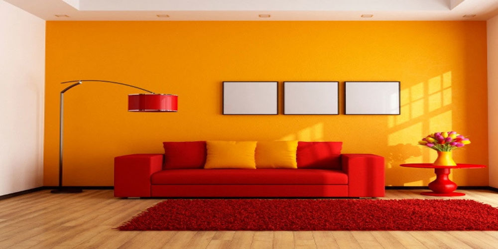
Red: Love, madness, excitement, good-hearted but selfish
Purple: Authority, power and monarchy (the colour of mystics and psychics)
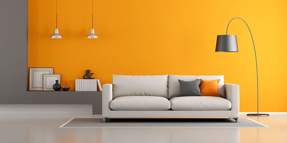
Orange: Warmth, honesty, satisfaction and happiness
Pink: Calm, childish tenderness, loved by others
Mustard: Good-hearted and trustworthy
Warm colours stimulate the nervous system and intensify emotions. These colors are clearly visible and attract attention. If you want to create an exciting atmosphere, use yellow and orange colors. These colors are related to the appetite and cause your stomach to swell, that's why restaurants use more of these colors. If you have a diet and you calculate the calories of foods, you may not want to use these colours in your kitchen! You should be very careful in using these colours because yellow and orange colors reflect a lot of light and irritate the eyes, as a result they cause eye discomfort.

An example of a combination of warm colours in interior design
Cool colours: blue, purple, turquoise, bluish green, green
Green: Youth, nature, sanctity, healing power and healing
Light blue: Peace, tranquility
Dark blue: Power of order, honesty, perseverance
Turquoise: Mysterious and unpredictable
Purple: Selfish and bold
Cool colours are soft colours that have calming effects. If you want to be creative and help the brain synapses, use purple. By combining blue and purple, it balances the feeling of calm and motivation that encourages creativity.
Bright purple calms the environment and relieves tension. Using this colour in home and office space is great. If you are looking for a calm environment, use green or blue colours. These cool colours are soothing. It has been scientifically proven that the eyes focus directly on green with the retina, and this puts less pressure on the eye muscles. Blue reduces respiration rate and blood pressure so it is beneficial to use blue in busy rooms and rooms where you spend many hours as well as in the bedroom.


An example of a combination of cool colors in interior design.
Eaton colour wheel and how to combine colours correctly.
Johannes Eaton is one of the leading professors of chromatology. Eaton was born in 1888 in Thun, Switzerland.
Using the Eaton colour cycle is a surefire way to find colours that match our desired colour. This wheel has twelve colors in which three colors: red, yellow and blue are the main colours and the colours between them are known as secondary colors. Each colour in this cycle can be well combined with its side colours, which are the colours of its family, as well as the opposite colour, which is its complementary colour and creates a beautiful and harmonious result. The use of colours of the same family, which are placed next to each other in the colour cycle and are so-called neighbours, together they create a gentle and harmonious combination that easily guide the viewer from one to the other.
The colour wheel works by first combining two adjacent primary colors to form a sub-color. For example, red and yellow form the orange; yellow and blue form green; blue and red form the sub-colour purple. Then a main colour with its adjacent sub-colour creates the next sub-color, and this cycle continues by combining adjacent sub-colours. The human eye is an amazing organ and in the right light is able to recognize about ten million different colours. Most of the colours seen with the human eye are obtained by combining the three primary colours red, blue and yellow. The three primary colours are never combined.
Colour in architecture and interior decoration
Using a colour with a small amount of its complementary color, if done correctly and in the right sizes, creates a brilliant and impressive result. This adds to the charm of the chosen colour collection and prevents a colour from completely dominating the room.
Walls in soft and subtle colors, such as bone, are great for living, but creating contrast in them by choosing special colors in tiles, ceramics, home appliances, veneers and furnishings makes the space more invigorating. In order to make the right connection between our personality and the interior decoration of the house, we must get rid of the fear of being different from others, a problem that we deal with a lot today that overshadows many architectural and interior designs. In a black and white society, one cannot have colourful thinking and imagine a better tomorrow. Effective work with colour, above all, requires a sense of creativity. Obtaining a suitable colour combination that exactly matches the purpose and goal of the person is itself a kind of "creation". Such factors in choosing colours for buildings, interior decoration and space furniture, create different approaches in design.
Colour is one of the determinants of style and context through which we communicate with our surroundings, and more than any other independent factor, it can turn a dull and monotonous atmosphere into a refreshing place.
Changing the colour of the walls can have more dramatic results than changing the furniture or even the structure of a room. So far, many houses have been painted in beige and cream colours and tones, and the standard colour for new houses is Magnolia, but it must be considered how to use these colours in different social conditions.
Colour trends in interior design have evolved over time. Every year, big painting companies like Sherwin Williams and Pantone announce their colours of the year, and interior designers use these colours to create living spaces, beautiful kitchens, bathrooms and toilets.
The colour of the interior design of the year is strongly influenced by fashion trends. In fact, most interior design trends, including colours, materials, etc., rely on fashion trends inspired by the world's fashion capital, Milan.
Here we introduce the most attractive colour trends of 2020. Feel free to revitalize your home with them.
8 most popular colour trends of 2020
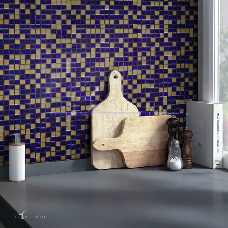
1. Champagne
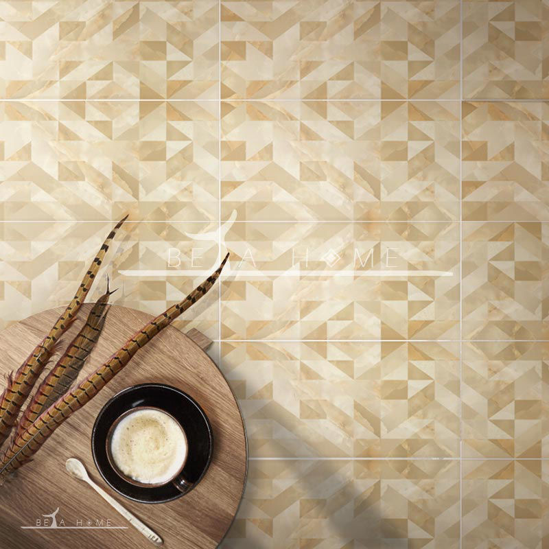
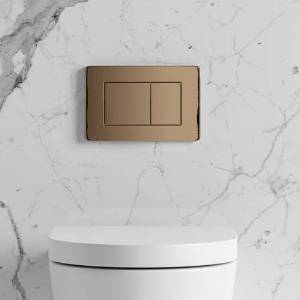
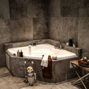
Champagne is one of the biggest colour trends of 2020. If you think champagne is boring, you better think again. Champagne has replaced the cold grays that have dominated the world of interior design for years. This natural beige colour makes the room feel warmer than its gray counterpart. Champagne adds an earthy feel to the interior and creates a relaxing environment. If you want to add champagne to your room, it is better to combine this colour with bold textures and materials, or you can use gold, silver, wooden or metal accessories. A few combinations of this colour in the tiles of the Guell collection are shown in the image above to help guide you in using this beautiful color.
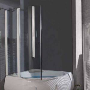
2. Navy Blue
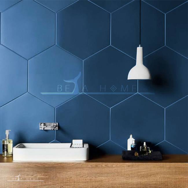

As mentioned, blue is suitable for reception areas and creates a balanced office environment. Blue alone, in a variety of shades, creates a beautiful, calm and heavenly environment that is a great choice for bedrooms and bathrooms. Navy blue is a color that is very popular and growing. The Sherwin Williams colour of the year for 2020 is code Naval SW 6244 which is a dark and rich navy blue. This color is reminiscent of the night sky.
Dark blue in combination with champagne, gives any home a cozy and pleasant feeling. This colour creates a unique effect in the bathroom. You can choose it to create a stunning floor on the floor of your bathroom. This color is also suitable for playful children's rooms and helps to calm them down.
3. Golden yellow
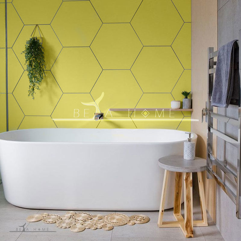


Yellow; warm and sunny, bright, positive, captivating, joyful, hopeful, inspiring and used as a sign of welcome. A soft yellow color, such as gold in the dining room, stimulates the appetite. The colour of mustard is happy and fits the mood of children and teenagers. This colour strengthens memory and helps reading. It should be noted that its use alone causes unease, so it is better to use it in combination with other colours.
Yellow is optimistic and happy and enlivens any room, although overuse can create the opposite effect. Designers often use pale yellow for walls in the house. Gen-Z yellow was a popular color in 2019, but golden yellow has replaced it in 2020. This new colour trend 2020 will give freshness and vitality to interiors. This colour will look good in kindergartens, workplaces, bedrooms and living rooms.
4. Olive green

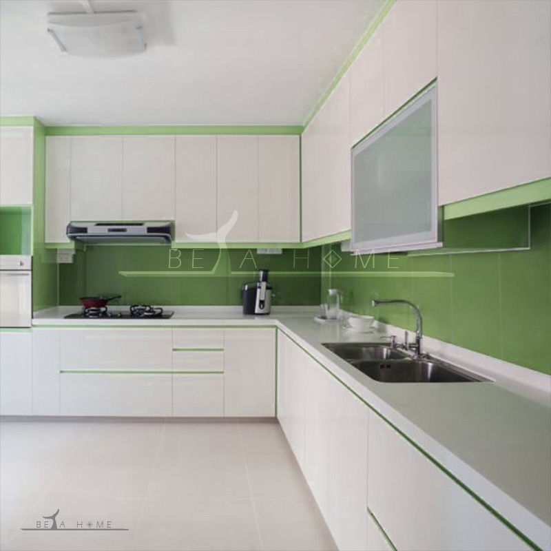
Green is a great choice for bedrooms and bathrooms because of its soothing properties. When green is used in combination with purple in silver it creates a beautiful effect. The use of green has a unique use for interior decoration due to its neutrality. Green is not used in skin and beauty salons and even in boutiques and clothing stores due to the lack of skin colour reflection. Green was a popular color trend during Milan Design Week 2019, and we will see more of it in 2020. In particular, olive green is in the spotlight. Light olive green can be used on kitchen or bathroom walls as well as exterior walls.
5. Light pink
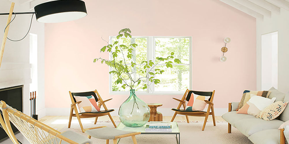

Pink is very soft and delicate. This pale, delicate, gentle and soothing colour evokes emotion. Pairing pink with chocolate browns is very effective. Pink is often the favorite color of girls, maybe because they feel good about it and it instills a sense of intimacy in them. For this reason, it is mostly used in girls' bedrooms, but it is also suitable for guest rooms. The use of pink is not limited to childrens rooms, it can be used in throughout different rooms in your home.
Bright pink will be very popular in 2020. Benjamin Moore announced his colour of the year: First Light 2102-70, a refreshing and pleasant color of pink.
Light pink is a vibrant alternative to white or beige. It can be used in the living room, bedroom and even the kitchen. This coluor enlivens any space and combines well with other colours.
6. Dark red


Red symbolizes joy and happiness, luck, luxury and newness, love and affection. Red is an exciting colour and is a very important and common colour in Asian countries. Care should be taken when using red. It is preferable to use red sparsely as accents. In home decoration, it is better to use red color in special and favourite places so that this part is more prominent. The use of red around the fireplace, even if it is off, indicates the presence of heat. By using red, the environment becomes more intimate.
Red is not a good colour for the bedroom, as it increases respiration and reduces sleep and relaxation.
In commercial places, the use of red leather furniture in a completely white space with red pendants is attractive and encourages people to sit down. Red can also be used in salons. Dark and rich reds are not only offered for the fall season, they were very popular in the field of interior design in 2019, Sherwin Williams announced Cavern Clay as the colour of the year, and its various colour shades will continue to be popular throughout 2020.
Dark reds make a room feel comfortable and warm. You can use it as a complementary colour along with other colours or as a feature wall of your house. It can be easily combined with other colours with shades of red and black to create a beautiful atmosphere.
7. Charcoal

Charcoal is a great colour for interior designers as it is neutral and can be used with any other colours. If you want to reduce the amount of attention to something, you can make it matte black. Charcoal with metallic colours of gold, silver, copper and brass has a unique effect.
This colour is often used in joinery to create elegance. A bench with a charcoal granite surface can give a beautiful look to the kitchen. Charcoal is also a good choice of colour for the floor. Black and white in a chequered pattern is used in the form of tiles or mosaics on the bathroom floor, because it makes the space look bigger with the contrast it creates.
Using black alone is not suitable for wall paint, as it closes the environment and appears scary. Black is commonly used for light switches and door handles as a neutral color that makes objects and designs around them look good.
Dark colours have been trending for some time and will continue their trend in 2020. Charcoal is a very stylish and intimate color that can be used almost anywhere, such as: bedroom, kitchen, bathroom.
Charcoal can be used only on one wall or it can be the main colour of a room. This colour perfectly combines with other shades of gray and creates interest and visual depth in the space.
8. Mango
Mango colour screams fun, energetic and delicious! This attractive colour trend in 2020 has taken over the world of interior design. Like most bold colors, mango can be used as a complementary colour in living rooms or dining rooms. It can also be used in room decor furnishings (cushions, chairs). This colour makes the room brighter and slightly larger. Mango is a combination of yellow and orange that has inherited the positive characteristics of both. From orange, it has warmth, honesty and happiness, and from yellow it has beauty, creativity and energy.